
Project Overview
What this was
A contract engagement with BD to design the Med Shortage Manager module inside HealthSight Analytics, their hospital inventory optimization platform. I owned the module end to end — understanding the workflow, defining the information architecture, designing the screens, and delivering a fully interactive Axure RP prototype their team could test and build from.
Who it was for
Hospital pharmacy managers and inventory analysts. The person who finds out on a Tuesday morning that a critical injectable is short nationally, has an unknown number of doses scattered across dispensing cabinets, carts and central pharmacy, and needs to know before the next shift whether they can cover it, where to pull from, and what to substitute if they cannot.
The problem with what existed
A medication shortage is not an inventory problem. It is a time problem with an inventory shape. The existing tooling could tell you a stock count and a reorder date. Everything else — working out how many days that actually represents, hunting down where the doses physically sit, the calls to other facilities, the substitution decision, and the record of what was agreed with whom — lived in spreadsheets, email and somebody’s memory. The design problem was never showing the shortage. It was showing it alongside everything a person needs to act on it, without turning the screen into a wall of data.
Walkthrough
Two minutes through the live prototype. Every control responds and every state changes — this is the prototype behaving, not a video of static mockups.
Or click through it yourself. The prototype is still live.
Open the Interactive Prototype
Password: demofinal — open the Inventory Optimization tab on the left navigation, then click around. Try the Med Shortage Manager tab for the module covered here.
How UX Helped
Four decisions, and all of them are about compressing a decision rather than displaying data.
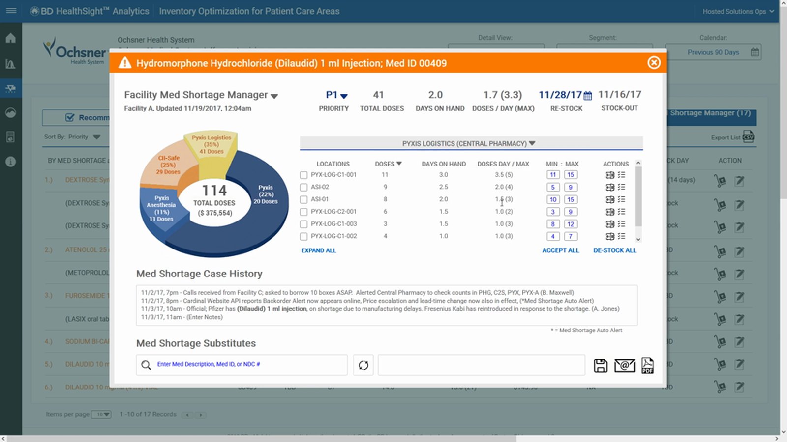
1. Days, not units
A dose count means nothing without consumption. I made days on hand the primary figure throughout, calculated against actual daily usage and its peak — because “forty-one doses” and “two days” produce completely different behavior from the same person. Projected stock-out and expected restock sit side by side, because the gap between those two dates is the entire problem.
2. Where the doses actually are
A facility total is a reporting number. The actionable version is the distribution — which cabinets, which carts, which pharmacy, how many in each, and how long each location lasts at its own usage rate. Accept and de-stock actions sit on the breakdown itself, so redistributing stock does not mean opening a second system.
3. The case history — the part nobody asked for
Talking through the workflow, the thing that kept surfacing was not data. It was the conversation: calls to sister facilities, counts verified, boxes borrowed, manufacturer delays confirmed. That narrative was the coordination layer, and it lived nowhere. So the detail view carries a timestamped, attributed log of what happened and who did it.
It means the manager arriving on the next shift inherits the situation instead of restarting it. In a multi-day shortage across several facilities, that is the difference between managing a problem and rediscovering it every morning. This is the feature I am proudest of on this project, and it came out of listening rather than out of the requirements.
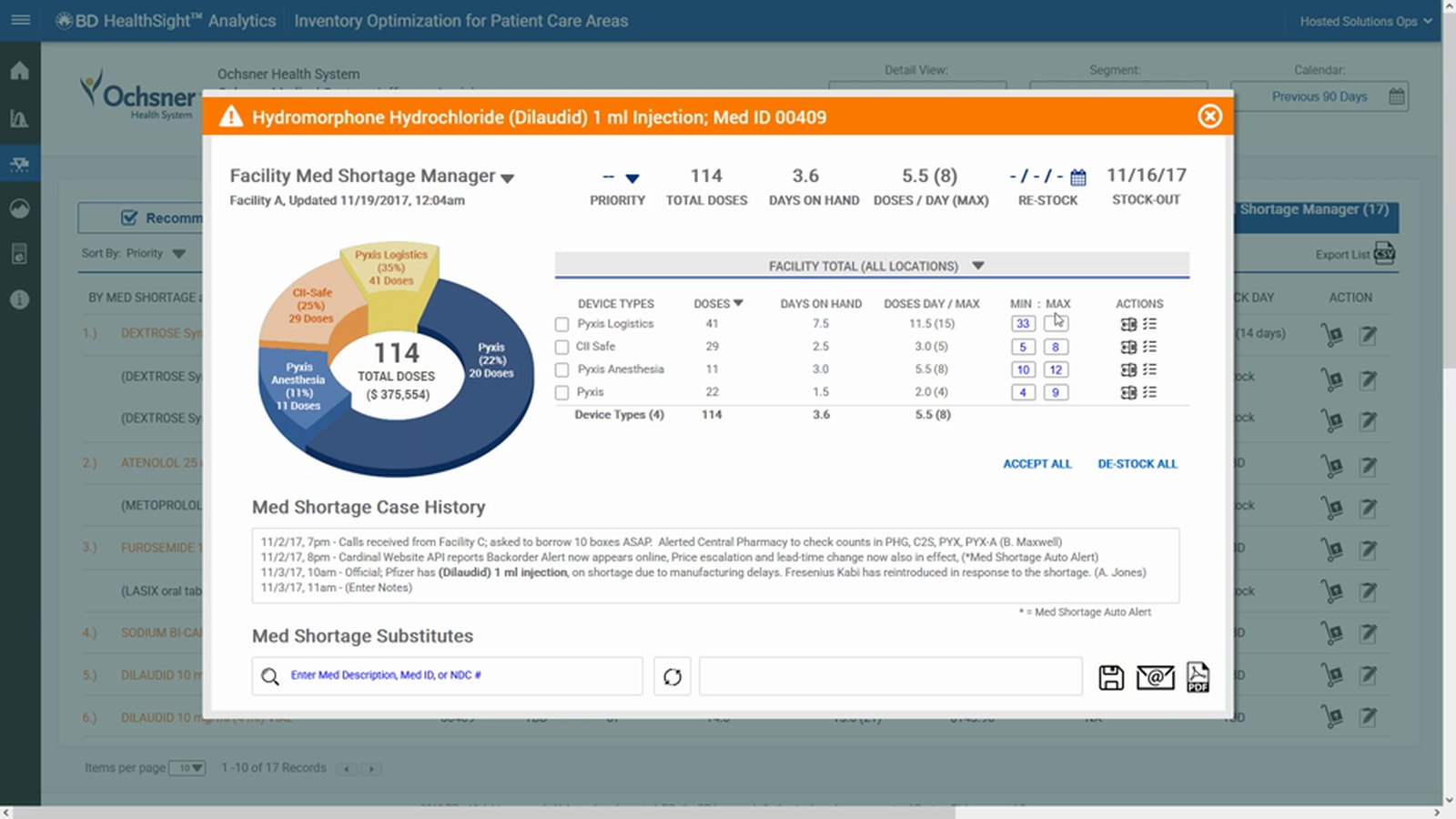
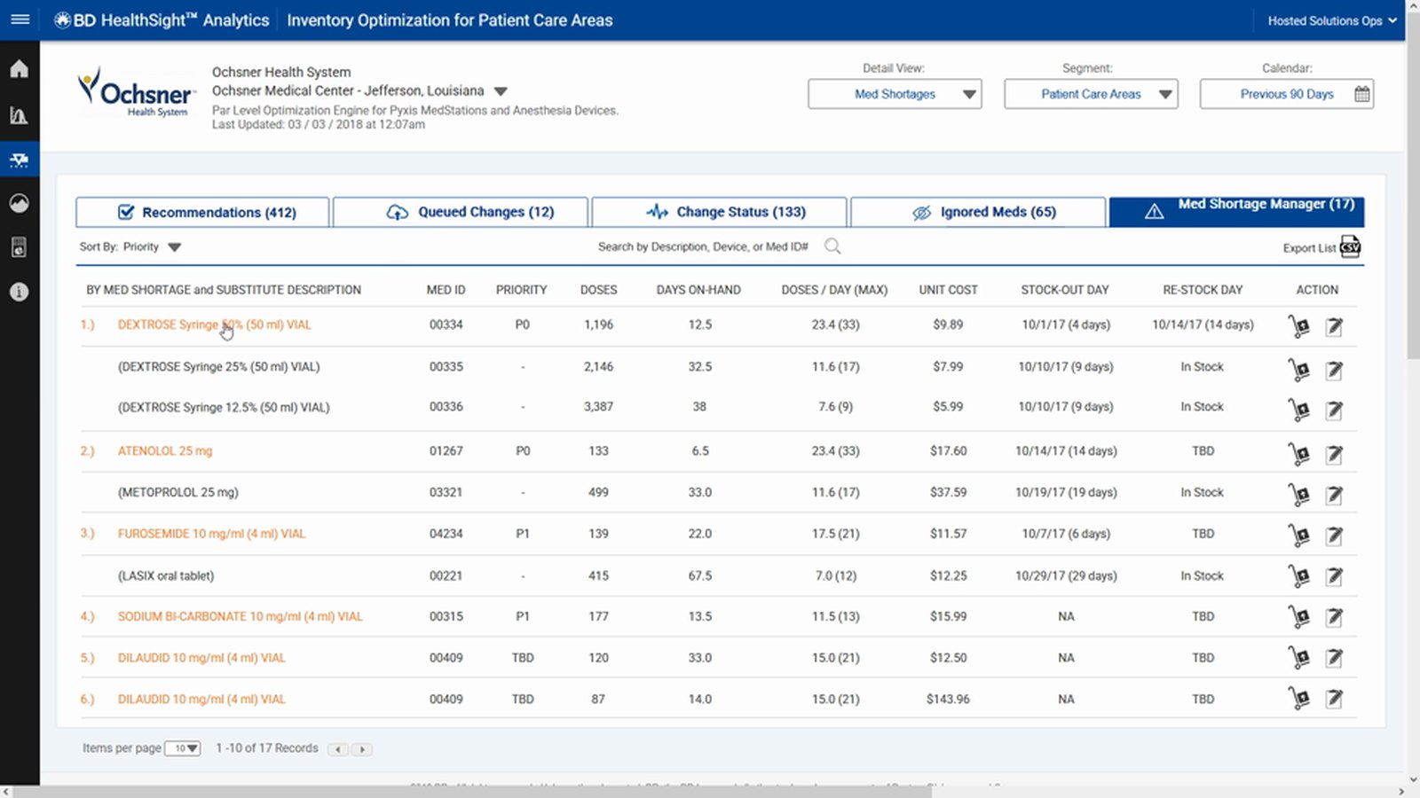
4. Substitutes in the same view
Substitution search sits inside the shortage detail, keyed on description, medication ID or national drug code. The moment somebody concludes “we are not going to make it,” the alternative is already on screen rather than three systems away.
Print, email and export sit on the panel itself, because shortages get escalated to people who are not in the tool. A decision support screen that cannot leave the screen gets retyped into an email by hand, and then the data is stale and wrong.
Fitting The Existing Workflow
The module was not a standalone alert screen bolted on. It is the exception path through a workflow that already existed, which is what made it adoptable.
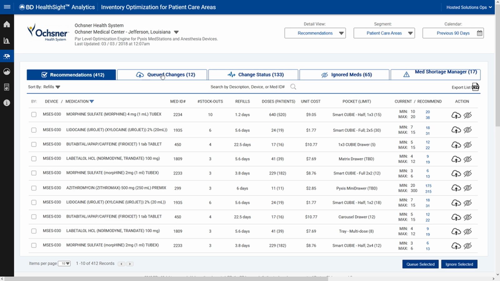
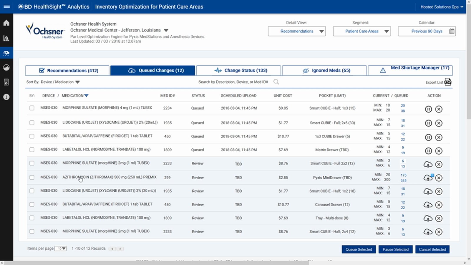
Recommendations, queued changes, change status and ignored items form a lifecycle: the system proposes par-level changes, a person accepts or defers them, and the record shows what actually went through and what failed. Med Shortage Manager is the fifth tab — the path for when the normal optimization cycle will not resolve something in time. Designing it as part of that lifecycle rather than beside it meant the people who already lived in this tool did not have to learn a new mental model to use it.
On Axure RP
Why the tool is worth mentioning
This was built in Axure RP, and the prototype genuinely functions — conditional logic, real data sets, state that persists as you move through it. Clicking a row opens the right record. Accepting a change updates the counts. It behaves like the product rather than illustrating it.
That is what made it testable
A prototype at this fidelity can be tested against scenarios: hand someone a situation, watch what they do, see where they stall. You cannot do that with a clickable picture. Most of my user testing before Figma adoption ran against prototypes like this one, which is how design defects got found before engineering wrote a line of code. The MedImpact ECS redesign elsewhere in this portfolio is the same approach at a much larger scale.
And it is still a live skill
Figma is where I work now, and my recent work reflects that. But regulated and enterprise environments still run on Axure, and plenty of teams have a decade of interaction specifications sitting in it. Being able to read, extend and test in a legacy tool is worth more than pretending the whole industry moved on at once. If your team has Axure in its history, I can work in it tomorrow.
What I Would Want You To Take From This
An older project, and the method is the one I still use
- Design the decision, not the data. Work out what the person is trying to decide and the order they ask the questions in, then build the screen in that order. Most enterprise dashboards show what the database has rather than what the decision needs.
- Find the work happening off-system. The case history was never in the brief. It existed in phone calls and email because no tool held it. The highest-value feature in a workflow product is usually the one people are already doing by hand.
- Fit the model that already exists. New capability designed as an exception path through a familiar workflow gets adopted. The same capability bolted on as a separate screen gets ignored.
- Prototype at a fidelity you can actually test. If it cannot respond, you cannot run a scenario against it, and you are collecting opinions instead of observing behavior.
- Be honest about the absence of metrics. This was a one-off contract deliverable and I was not there for the rollout, so I have no adoption or outcome numbers to show you. What I can show you is the thinking and a prototype you can click through yourself.