
Project Overview
One platform, two audiences, six levels deep
Leapfrog is the largest initiative I have worked on. A multi-year platform replacing how pharmacy benefits get configured and administered, serving two very different audiences through a single interface: organizations that administer benefits on behalf of their own downstream clients, and internal teams administering members directly. Both need the same core — find a client, open a benefit, see what it is set to, change it — but their defaults, permissions and starting points differ at nearly every turn. Building two products was never on the table.
The structural problem underneath it
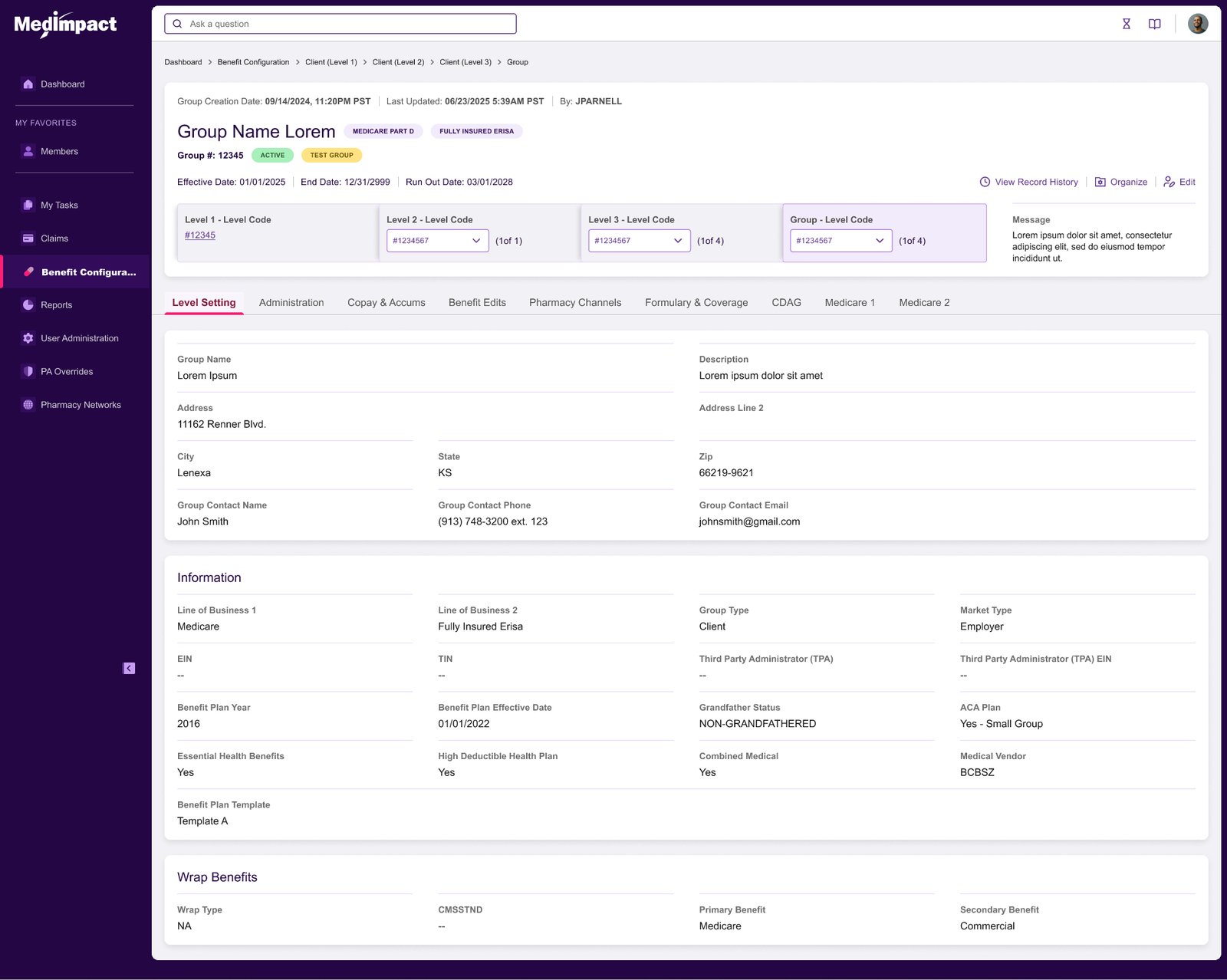
Configuration lives at six levels, from the system down to an individual group. A value set high up flows down and can be overridden lower. So the question on any screen is never simply “what is this set to” — it is “what is this set to, where was it set, and what happens if I change it here instead of there.” Get that wrong and a benefit administrator silently mis-configures a plan that real people fill prescriptions against. This is the kind of problem where a beautiful screen that hides where a value came from is worse than a plain one that shows it.
Benefits are assembled, not authored
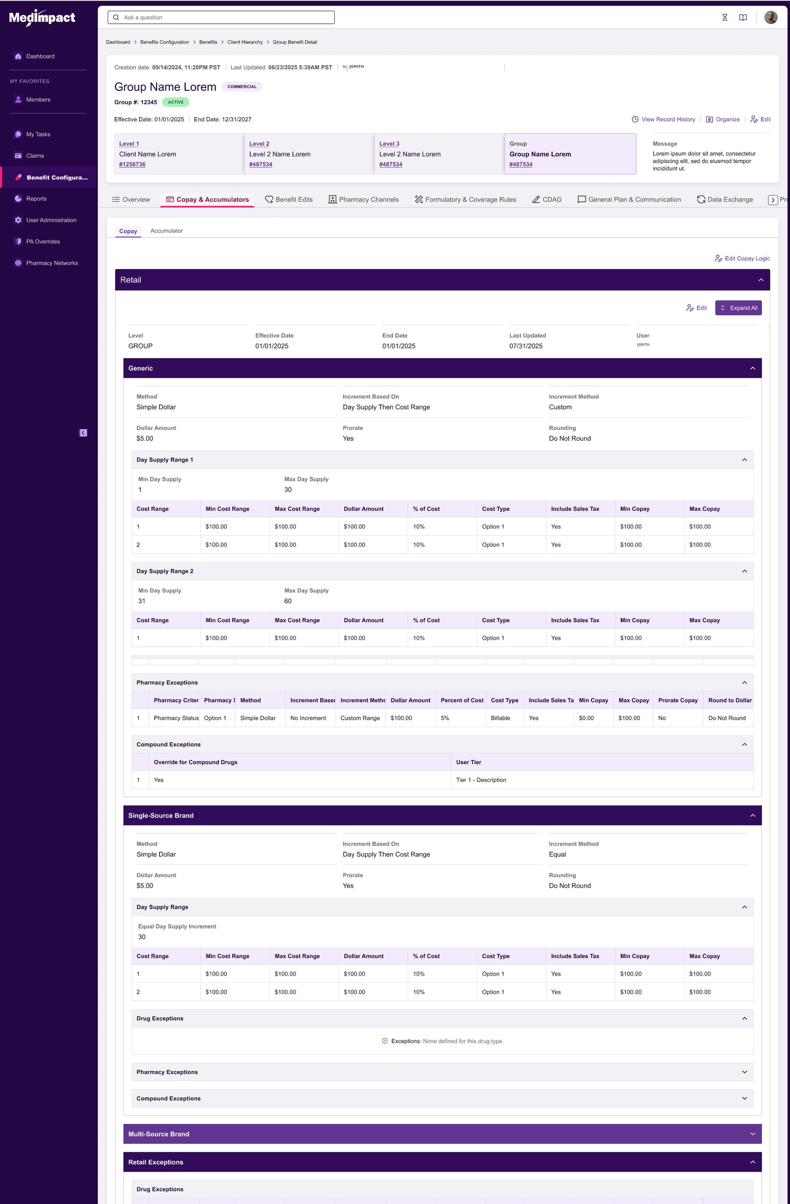
The central design decision, and the one everything else hangs off. A benefit is not a form somebody fills in from scratch. It is composed from reusable building blocks — drug lists, networks, rule sets, accumulator packages, benefit templates, provider lists, default settings. Each built once, then reused across many client configurations. The interface has to make a component feel like a thing you pick, not a field you retype.
How UX Helped
This was not one design phase. It was a repeating cycle, run per release, with the same gates every time.
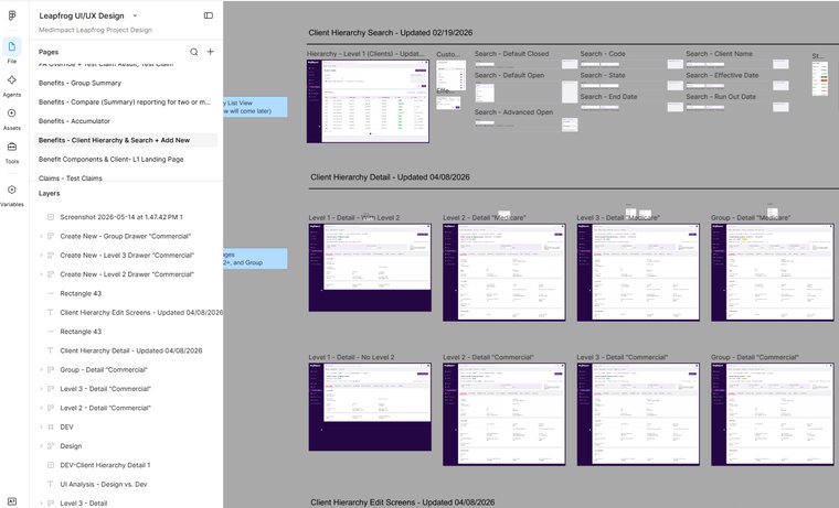
What did I provide?
- Requirements refined against personas built from the real user base, not invented ones
- Workflows and journey swimlanes, so gaps surfaced as missing steps rather than opinions
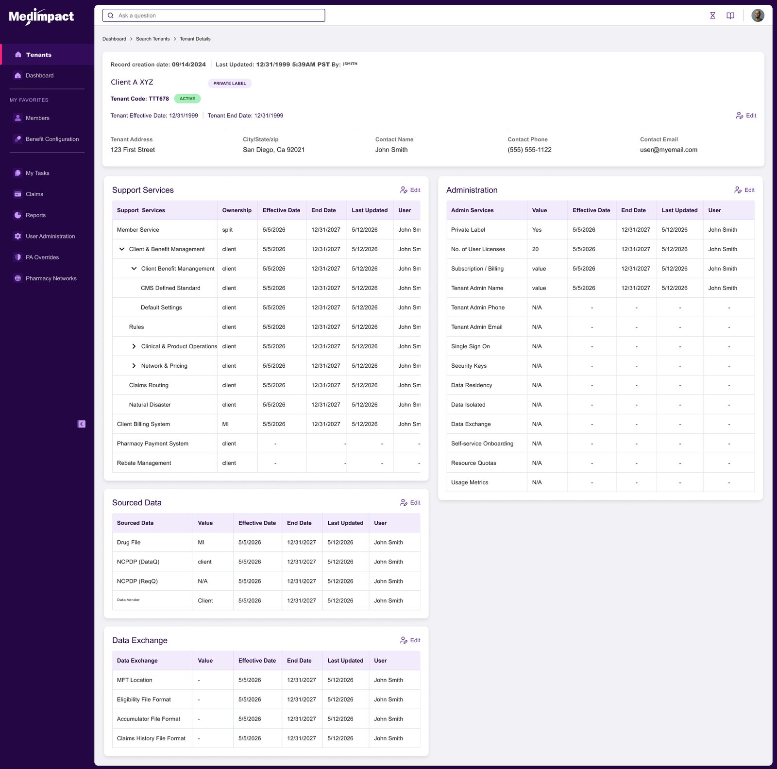
- Information architecture for a six-level hierarchy with inheritance and override
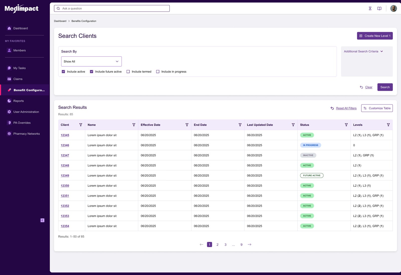
- Wireframes, then hand-built interactive Figma prototypes from our component library
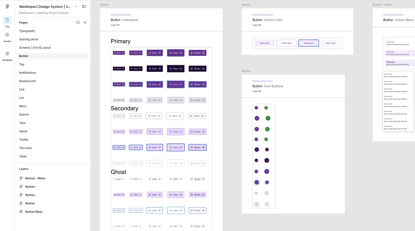
- A design system built for this project — 16 component families, governed as the single source of truth
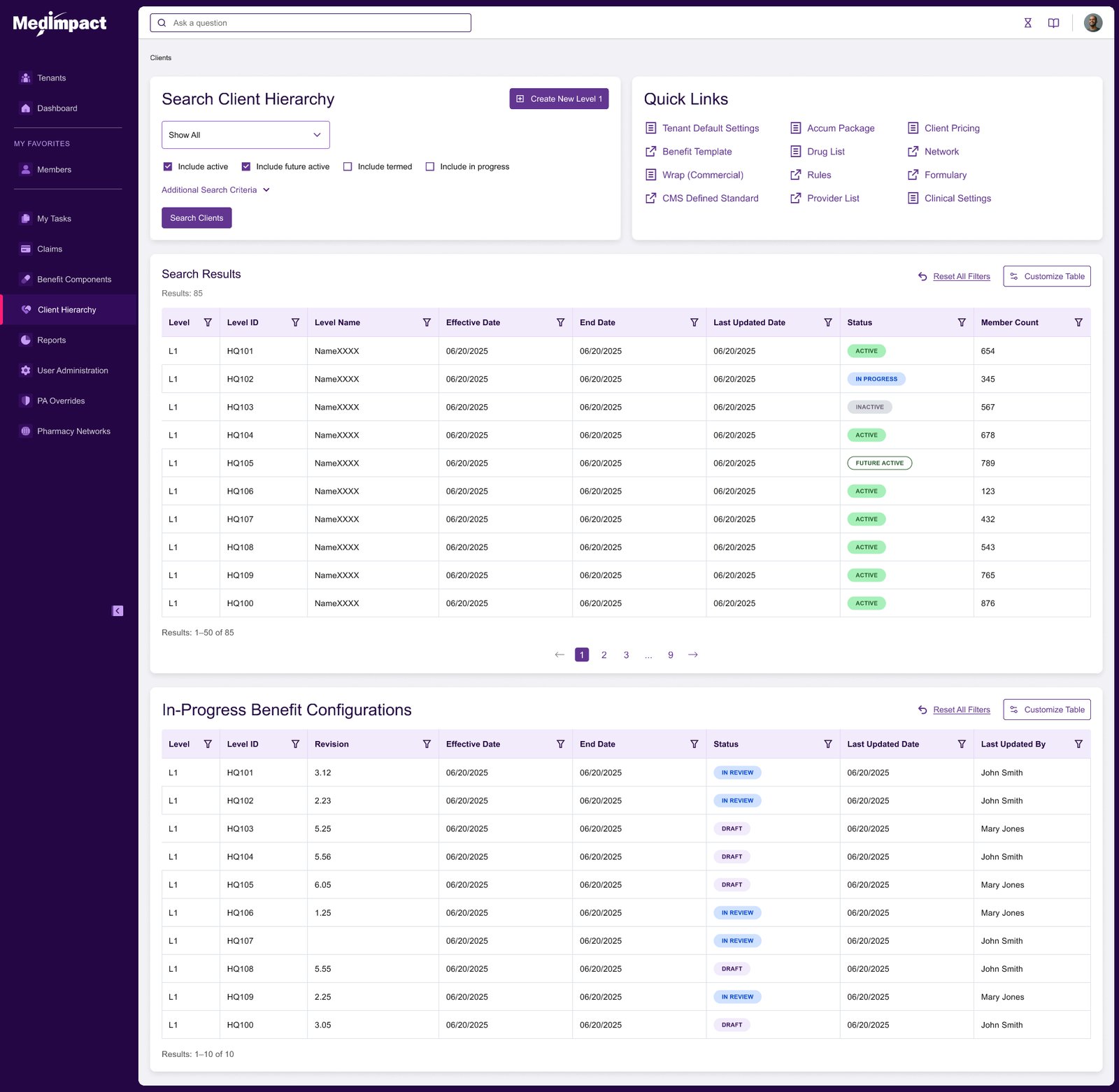
- Role-shaped landing page variants rather than one universal page with things greyed out
- Multiple rounds of user review and testing per module, with findings documented
- Competitive gap analysis that shaped both the product vision and the release sequence
The Screens
Hand-built Figma prototypes against the design system I created for the project. All data shown is placeholder. Click any image to view it full size.
How AI Was Used, And Where It Wasn’t
This project is the counterweight to the seven-day conference demo I ran the same year. Same designer, opposite balance — because the work called for it.
Not for the shipped screens
Every screen that reached engineering was built by hand in Figma against our governed component library. On a multi-year platform where components get reused across hundreds of client configurations, the component is the product. Generating screens that merely look right would have left us with a library nobody could maintain. I did use Claude for fast throwaway concepts during ideation on two modules — benefit management and cost share — to settle a direction quickly, then rebuilt by hand rather than carrying them into the prototype.
Competitive gap analysis, and what it decided
This is where AI earned its place. I ran our requirements against what comparable platforms actually offer and looked for the gaps worth building into. That analysis did two jobs: it sharpened the product vision, and it sequenced the roadmap. What ships in the first release, what follows, and why — argued from analysis rather than from whoever asked loudest. Deciding what ships first is a design decision, because it determines what everything after it has to live with.
Research synthesis
Refining user requirements and personas against a real user base rather than invented ones, then pressure-testing them into workflows and journey swimlanes so gaps surfaced as missing steps instead of opinions.
Knowing which approach a project needs
Either method applied to the wrong problem produces something that looks finished and is not. A seven-day conference deadline and a multi-year platform are different problems, and the skill is telling them apart before you start, not after.
The Process, Per Release
- Requirements, refined against users. Gathered from subject-matter interviews, then checked against personas built from the real user base and mapped into workflows and journey swimlanes.
- Ideation and wireframes. Structure argued out at low fidelity first, where changing it is cheap.
- Interactive prototypes. Built in Figma from the component library, not mocked — so reviewers reacted to something that behaved rather than something that looked.
- User review and testing rounds. Multiple passes per module, findings written up rather than left in a meeting. Open questions stayed visibly open until somebody closed them.
- Refine, then re-test. Requirements updated from what testing found, prototype updated, round repeated until the open list was empty.
- Dev-ready, and gated. “Done” meant the prototype was ready for inspection in Figma dev mode and both the product and business-architecture leads had signed off. Not one person’s call, and not a date on a plan.
Deciding what not to design
Scope got cut at these gates too. One proposal for fully configurable per-role landing pages was deliberately deferred rather than built, because the development cost outweighed what it bought in the first release. Saying no to a good idea at the right moment is part of the job.
Where It Stands
In flight
Several modules are complete and released; others are scheduled through the remaining phases of the program. Releases went out in deliberate sequence — client and member pages with a dashboard first, because that is where every user starts; benefit overview some months later; then organization-level configuration and cost share. Each one benchmarked and scheduled rather than shipped when it happened to be ready.
What it demonstrates
- Enterprise product design at platform scale, not feature scale
- Information architecture for hierarchy, inheritance and override
- Building and governing a design system other people and third-party vendors build against
- Running research, prototyping and testing cycles that end in documented sign-off
- Using AI where it adds leverage and leaving it out where it would cost more than it saves
- Release sequencing argued from analysis rather than from the loudest stakeholder