
Project Overview
Seven days, one transcript, a conference deadline
MedImpact needed a demo-ready analytics product for its GLP-1 Benefit 360 program in time for the MedLab '26 industry conference. I was brought in seven days before launch. The product had to tell one coherent story to a live audience: population-level GLP-1 spend and utilization, a clear path into two clinical programs, and a member-level view clinical teams could act on — all inside MedImpact's real brand system.
What I started with
A recorded internal working session. One transcript discussing requirements, open questions and a rough existing prototype. No requirements document, no wireframes, no approved direction.
Seven days is normally when discovery gets cut, not expanded
A project at this scope — discovery, IA, wireframing at two fidelities, visual and brand design, and a documented decision trail — is usually staffed with a researcher, an information architect, a prototyper, a visual designer, and someone keeping the paper trail straight. I ran all five roles. AI handled execution speed; I handled judgment, sequencing, and every decision that actually mattered.
How UX Helped
The constraint shaped the method. I didn't shorten the process — I compressed each stage of it, and kept the review discipline that compressed timelines usually lose first.
What did I provide?
- A traceable User Requirements Document parsed from the meeting transcript — every requirement linked to the moment in the conversation that produced it
- Information architecture for the population → program → member drill-down across 9 screens
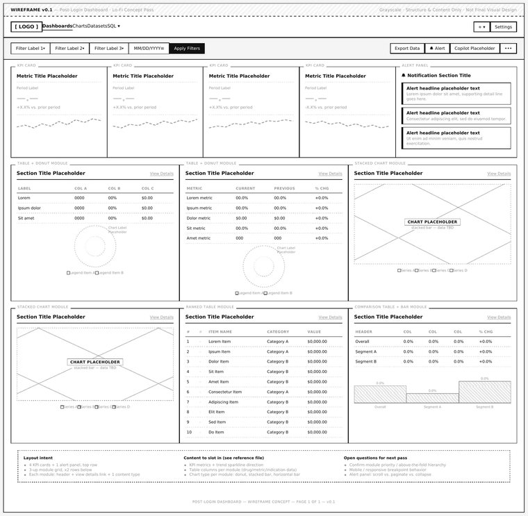
- Lo-fi wireframes at two fidelities: 9 annotated, plus 9 content-free section-zoning passes
- High-fidelity interactive prototypes built with Figma Agents from our governed component library
- Three documented findings and requirements rounds, including a full brand-compliance audit
- Two persona sets — conference audience and post-launch end users — with journey maps for each
- A 25-slide conference deck and a clickable production-fidelity prototype
Figma Agents, not Figma Make
This is the part I want to be specific about, because it is the difference between AI-assisted speed and AI-generated throwaway.
I drew the wireframe by hand
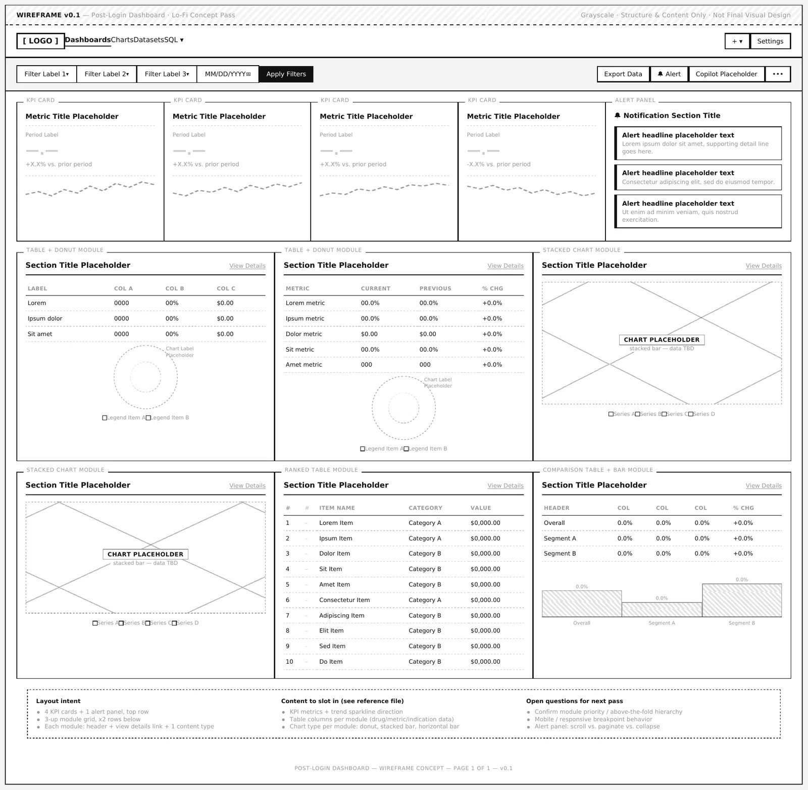
Directly in Figma, using our existing component library — placeholder components, real structure, no visual polish. I also produced a parallel content-free zoning pass for all 9 screens, restoring the wireframe-before-comp discipline the project had initially skipped. Structure is a judgment call. I wasn't going to generate it.
Then Agents took it to high fidelity
Once the wireframe was validated, I used Figma's Agents feature to rapidly generate and iterate multiple high-fidelity, interactive prototype versions from our governed design system — real components and tokens, not freehand AI UI. That's what put several genuine options in front of stakeholders within hours instead of weeks.
Why not Figma Make
Most “AI in Figma” conversations right now are about Figma Make — prompt-to-webpage generation that produces a standalone app disconnected from an organization's real design system. It's a genuinely useful tool for some things. It was not the tool this project needed. Agents works inside an existing file and respects an existing component library. Make would have produced something fast and disposable. Agents produced something fast and shippable.
From Wireframe to Shipped
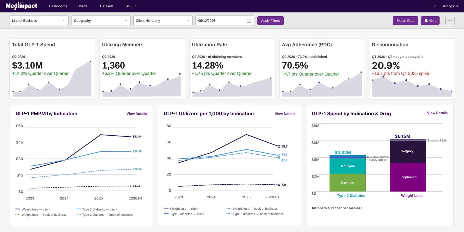
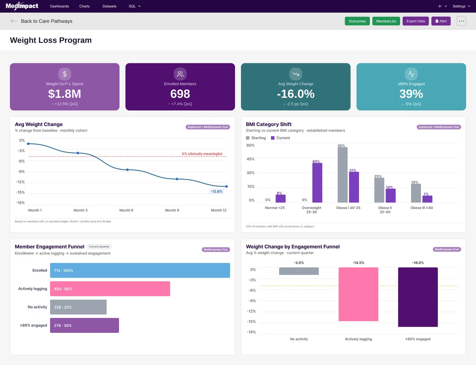
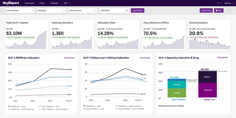
The same screen at two ends of the week. Click either image to view it full size.
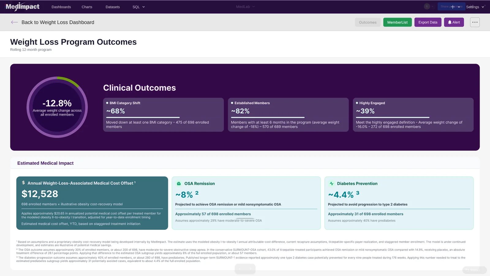
Interactive Prototype
The production-fidelity, navigable prototype used for the hands-on portion of the demo. It starts at the main dashboard and runs the full population → program → member path.
View the Clickable Prototype
Where I Kept the Human in the Loop
AI produced the work. Vetting it against reality was mine to do, every time. Three catches made it into formal project documentation because they had real downstream consequences.
A color that shouldn't have existed
Auditing the final build against MedImpact's brand guide, I noticed the shipped product used an amber tone for “Medium” risk indicators — but the guide's alert system only defines green, magenta and red. Instead of silently forcing it to match, or shrugging past the mismatch, I flagged it as an undocumented brand exception, reconstructed the clinical reasoning for it, and logged it formally. An unflagged, unofficial color in a shipped healthcare product is exactly the kind of small inconsistency that becomes an expensive rebrand headache eighteen months later.
Two brand files, two different answers
Cross-referencing the brand guide PDF against a separate brand-colors reference image, I caught that the two source files listed different hex values for the same Blue accent — a one-character difference easy to skim past. I didn't guess which was right; I flagged it explicitly as an open item requiring confirmation before it got baked into production design tokens. Caught at audit, that costs five minutes. Caught after six more screens are built on it, it costs a rebuild.
The drift was real, and it shrank
Early Agents output showed small, plausible drift — a chart header in the wrong typeface, a color close to our palette but not pulled from it, an element built freehand when a governed component already existed. None of it dramatic. All of it the kind that ships unnoticed if nobody who knows the design system is checking. As I got more specific in what I asked Agents to do — naming the exact component, pointing at the right token, describing the underlying pattern rather than the visual outcome — later versions needed noticeably less correction.
Impactful Conclusions!
Real Results
- Transcript to a conference-ready deck and clickable prototype in 7 days, against a fixed launch date
- 35 artifacts produced en route — 7 strategy documents, 18 wireframes across two fidelities, 10 comps and brand-corrected mockups
- 9 screens carried from wireframe through brand audit to final approved build
- Comparable discovery-through-design work is commonly benchmarked at 8–14 weeks — roughly an 85–90% compression
- Marketing vetted and signed off the final build against the brand system before the conference floor opened
- The demo generated more qualified sales leads than forecast, from prospective new customers, and attendee feedback on both the product story and the walkthrough was strongly positive
What I'd take into the next one
The timeline is only interesting if what ships survives a brand review and holds up in front of buyers who do this for a living. This one did both — but the reason it did is that the design system already existed and was governed. Agents accelerates work inside a real component library; without one, it generates plausible-looking UI with nothing underneath it. The next thing I'd push for is making the two documented brand exceptions this project surfaced part of the official guide, so they stop living in a case study and start being discoverable.